Fan Marketing Awards 2025
The best of fan marketing from the past year
Brand Guide
Instructions and guidelines on how to work with Tradable Bits logos, colours, and typography.
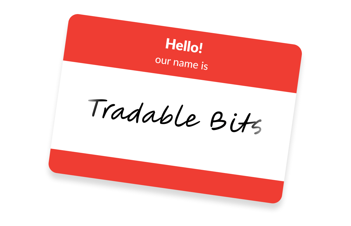
Company Name
The company name is stylised as two words with a capital T and B.
This is how the name should appear in any body of text outside of the official logo.
Logo Guidelines
Always make sure the logo has plenty of space and isn't stretched.
Feel free to use the logo that fits your use most suitably. Use the icon if space is limited.
Refer to this diagram for a guideline on spacing; the blue area should be left empty.
Don't use these graphics in a way that would imply partnership or endorsement by Tradable Bits to your company or product.
Colours
TB Dark Green
| Hex | #038B6D |
| RGB | 3 139 109 |
| CMYK | 85 23 69 6 |
| Pantone | 3288C |
TB Light Green
| Hex | #50BD91 |
| RGB | 80 189 145 |
| CMYK | 66 0 57 0 |
| Pantone | 7723C |
TB Gold
| Hex | #F4B913 |
| RGB | 244 185 19 |
| CMYK | 4 28 100 0 |
| Pantone | 1235C |
TB Dark Grey
| Hex | #262626 |
| RGB | 38 38 38 |
| CMYK | 71 65 64 69 |
| Pantone | 419C |
TB Gradient
| Hex 1 | #00665C |
| Hex 2 | #29B473 |
Typography
Aa
Cocogoose
When to use:
Cocogoose is the primary brand font used for the logotype/logo wording. It is also used for large
headers on the public facing website and other marketing collateral.
It can also be used as the standard when stronger emphasis is needed, such as in: stationery,
website design, brochures and all forms of general correspondence
Aa
Lato
When to use:
Lato is to be used for all other forms of standard body text, ranging from: stationery,
data tables & reports, website design, brochures and all forms of general correspondence.
Want To Learn More?